Themes
Learn how to customize the look and feel of the llms .py Web UI using themes. Create your own themes or use the built-in options to personalize your UX
llms.py includes a powerful theming system for customizing the appearance of its Web UI. Themes control color schemes, background images, and CSS/Tailwind classes across UI components, letting you tailor the interface to match your brand or preferences.
Default Themes
The Web UI comes with the following themes built-in:
- dark: The default dark theme.
- light: The default light theme.
- blue_smoke: A dark theme with dark blue ascents.
- light_sky: A light theme with soft blue and cyan tones.
- light_slate: A clean, balanced light theme using slate grays.
- matrix: A dark theme inspired by the Matrix (black and neon green).
- nord: A cool, arctic-inspired dark theme based on the popular Nord color palette.
- soft_pink: A warm, friendly light theme with pink accents.
nord
Click to view full size
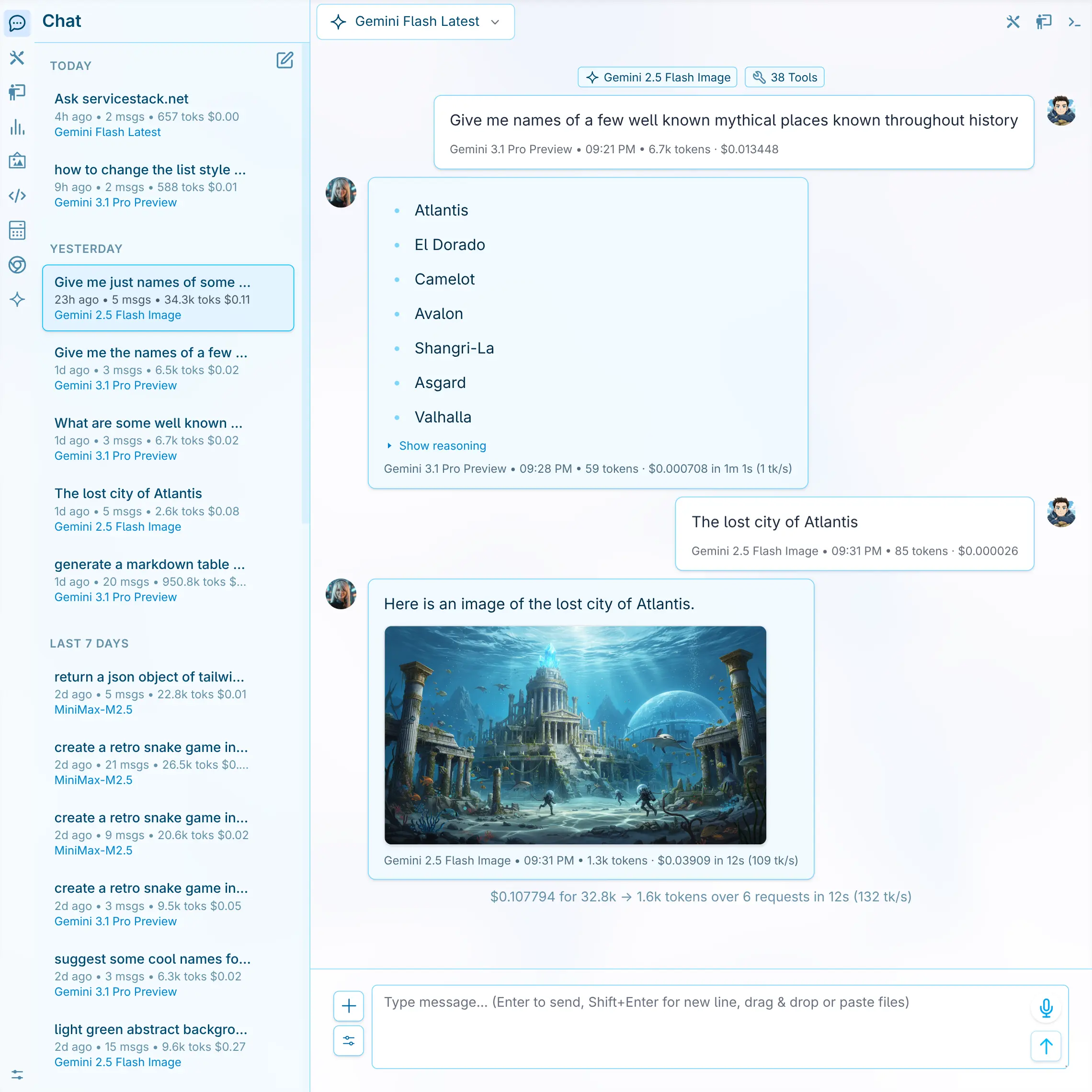
light_slate
Click to view full size
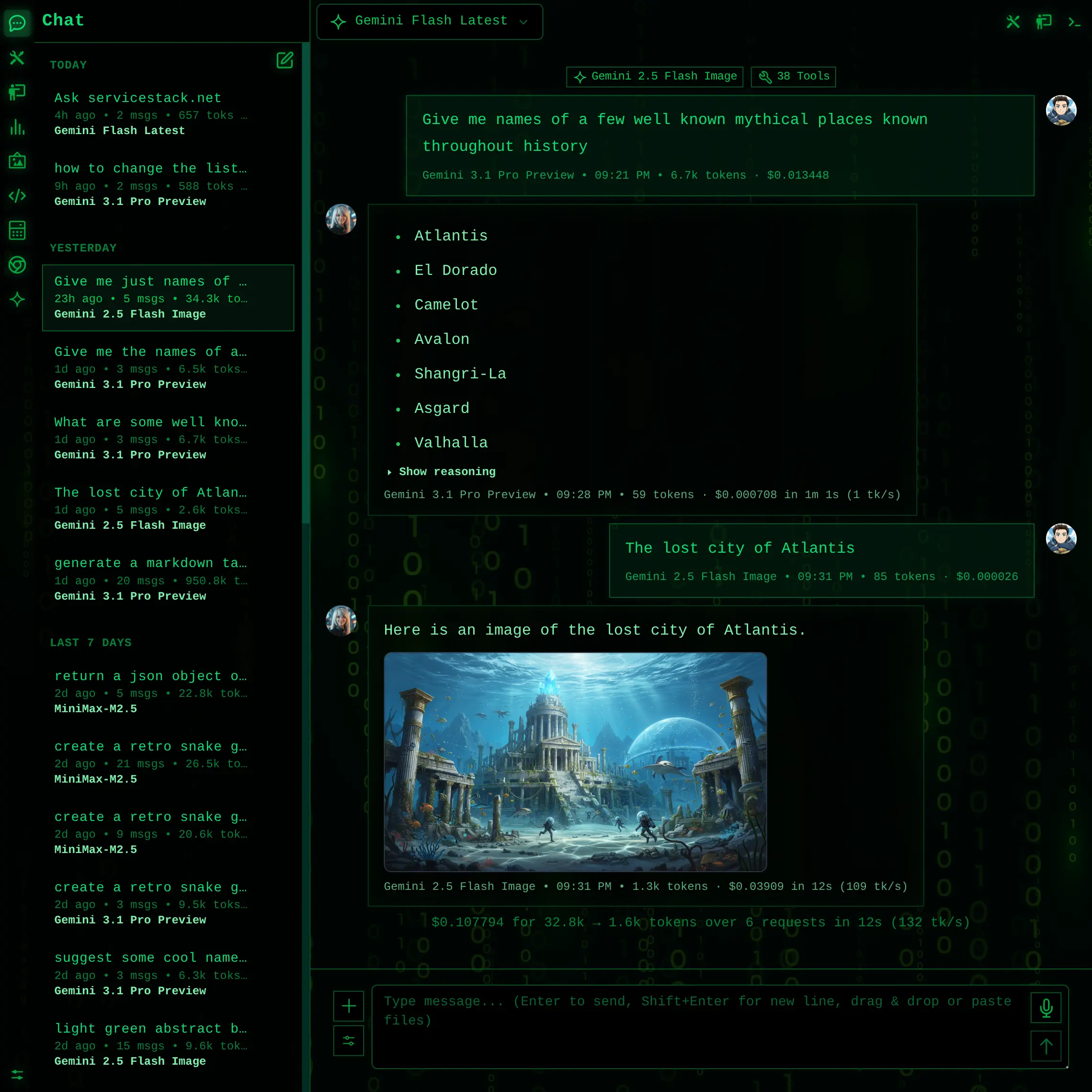
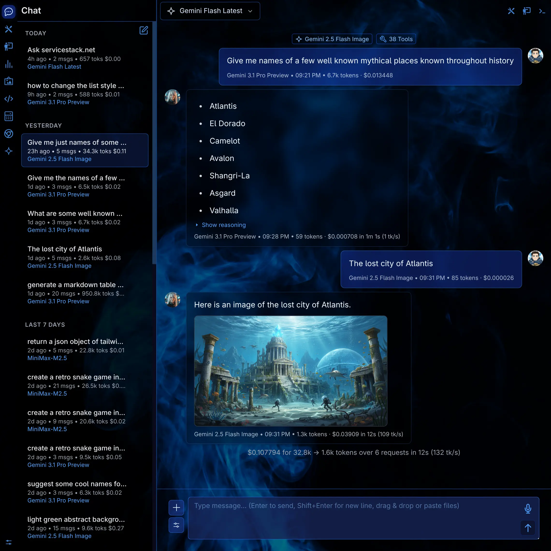
matrix
Click to view full size
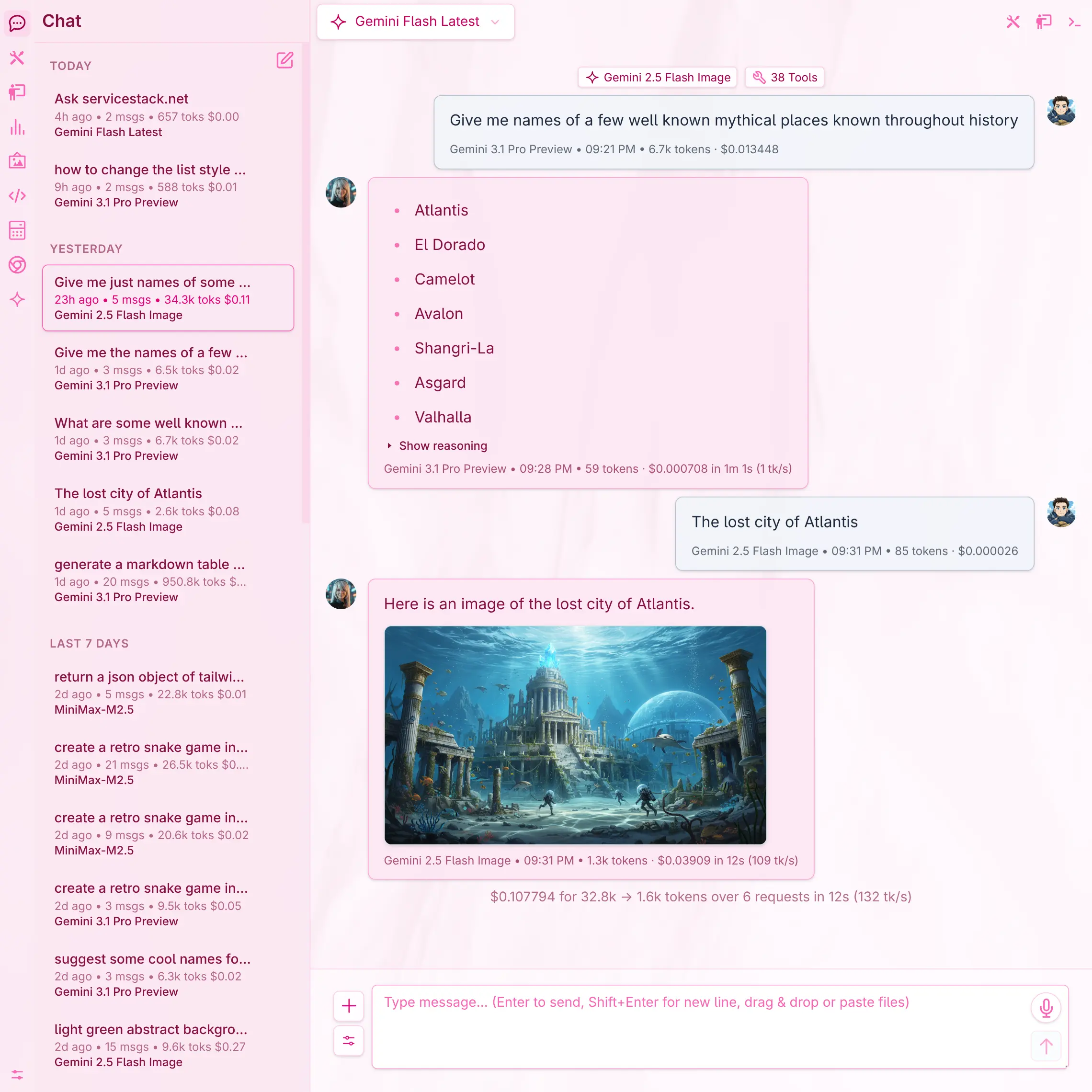
soft_pink
Click to view full size
blue_smoke
Click to view full size
light_sky
Click to view full size
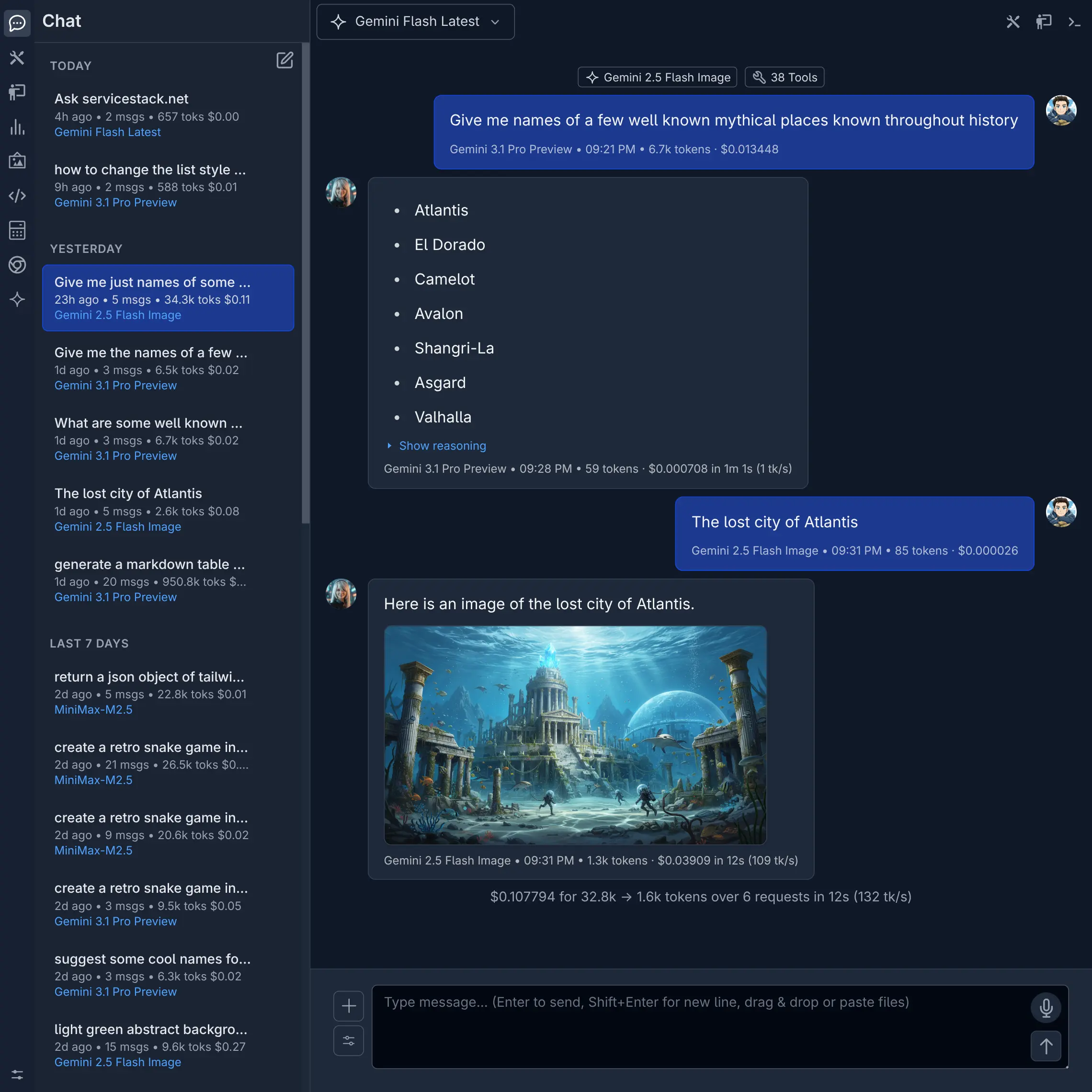
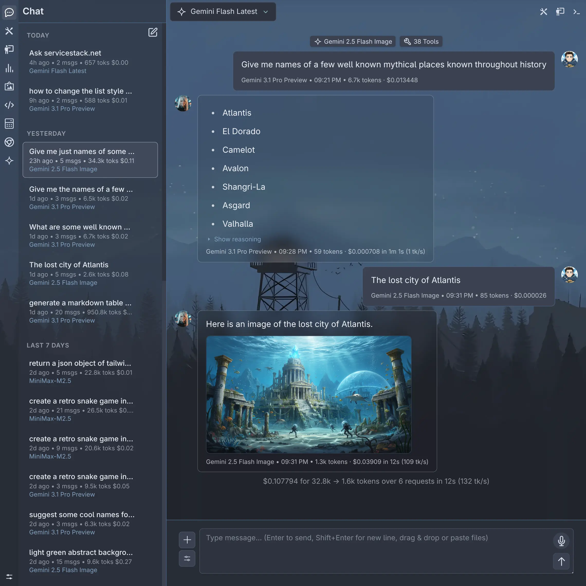
dark
Click to view full size
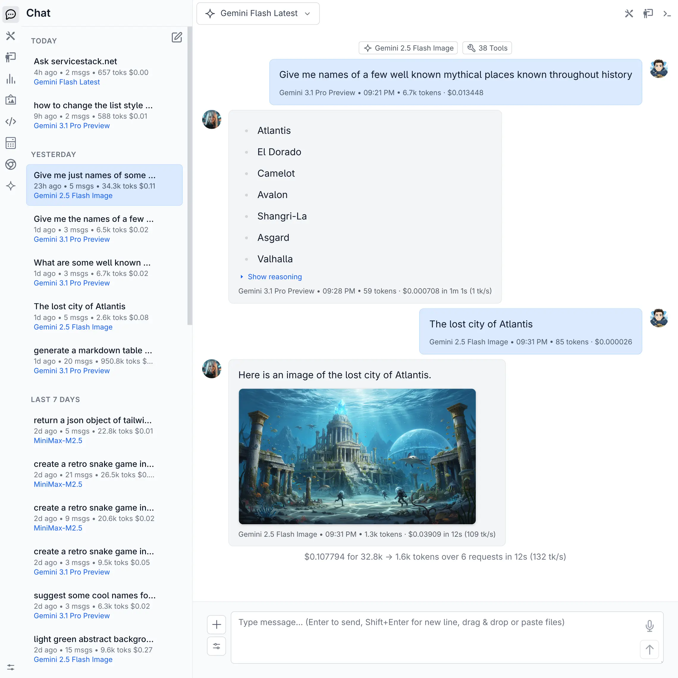
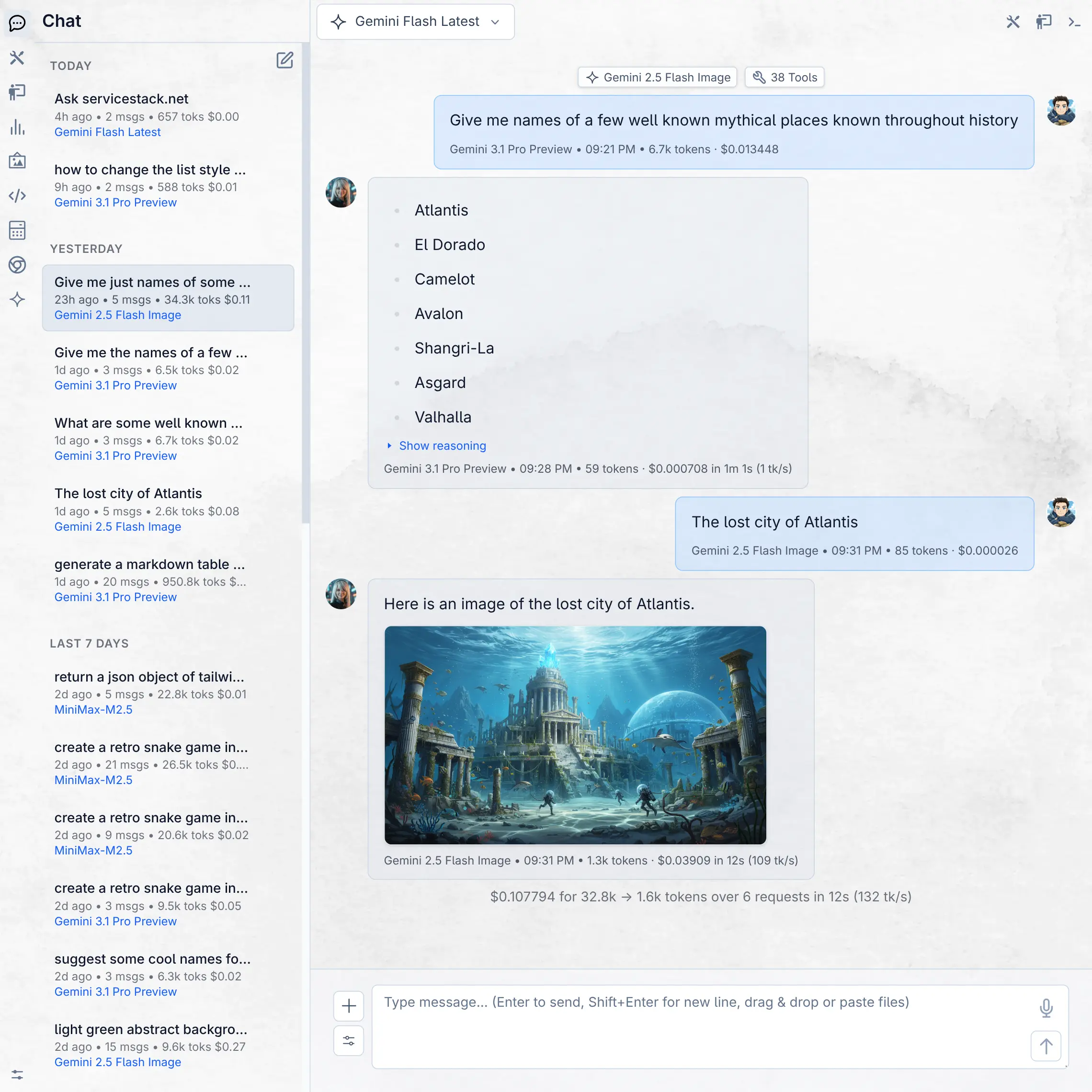
light
Click to view full size
How to Create a Custom Theme
Creating a new theme is straightforward. Themes are defined by JSON configuration files and optional assets.
1. Create a Theme Directory
You can add custom themes to the following locations:
~/.llms/user/<username>/themes
~/.llms/user/default/themes
Themes in the default directory are available to all users, while themes in the <username> directory are only available to that user. Existing themes can be overridden by adding a folder with the same name.
Example
Create a new directory for your theme. The directory name will be used as the internal identifier for your theme. For example, to create a theme called "Neon Vibes", you might create a folder named neon_vibes:
mkdir -p ~/.llms/user/default/themes/neon_vibes
cd ~/.llms/user/default/themes/neon_vibes
2. Create theme.json
Inside your new theme directory, create a file named theme.json. This file is the core of your theme and contains the styling configuration.
The minimal dark.json template just requires:
{
    "vars": {
        "colorScheme": "dark"
    }
}
Whilst the minimal light.json template just requires:
{
    "vars": {
        "colorScheme": "light"
    }
}
Any styles or vars that are not defined in your theme will fallback to the default light or dark theme.
3. Start from an existing theme
An alternative approach is to start from an existing theme from the built-in themes directory.
Download a copy of the dark.json theme template:
curl -o theme.json https://raw.githubusercontent.com/ServiceStack/llms/refs/heads/main/llms/extensions/app/themes/dark.jsonOr download a copy of the light.json theme template:
curl -o theme.json https://raw.githubusercontent.com/ServiceStack/llms/refs/heads/main/llms/extensions/app/themes/light.jsonA theme is composed of three main sections:
preview: Tailwind classes for displaying the theme in the theme selector.vars: Standard CSS variables handling the underlying color scheme, background, and borders. You must define"colorScheme"as"light"or"dark".styles: Tailwind utilities mapping specific UI components to their respective classes.
4. Adding Theme Assets (Optional)
If your theme includes custom assets like background images or distinct icons, you can create a ui/ directory within your theme folder (e.g., ~/.llms/user/default/themes/neon_vibes/ui/bg.webp).
You can then reference these assets in your theme.json file. For instance, to use a custom background image, you can define it in the vars section:
{
    "vars": {
        "colorScheme": "dark",
        "--background-image": "url(/themes/neon_vibes/ui/bg.webp)"
    },
    "styles": {
        "app": "bg-[image:var(--background-image)] bg-cover"
    }
}
TIP
/ui folder are served dynamically by at /themes/<theme-name>/ui5. Typography in Markdown
Themes can also define the typography used in markdown by overriding these Typography CSS variables:
{
    "--tw-prose-body": "#374151",
    "--tw-prose-headings": "#111827",
    "--tw-prose-lead": "#4b5563",
    "--tw-prose-links": "#111827",
    "--tw-prose-bold": "#111827",
    "--tw-prose-counters": "#6b7280",
    "--tw-prose-bullets": "#d1d5db",
    "--tw-prose-hr": "#e5e7eb",
    "--tw-prose-quotes": "#111827",
    "--tw-prose-quote-borders": "#e5e7eb",
    "--tw-prose-captions": "#6b7280",
    "--tw-prose-code": "#111827",
    "--tw-prose-pre-code": "#e5e7eb",
    "--tw-prose-pre-bg": "#282c34",
    "--tw-prose-th-borders": "#d1d5db",
    "--tw-prose-td-borders": "#e5e7eb",
    "--tw-prose-invert-body": "#d1d5db",
    "--tw-prose-invert-headings": "#fff",
    "--tw-prose-invert-lead": "#9ca3af",
    "--tw-prose-invert-links": "#fff",
    "--tw-prose-invert-bold": "#fff",
    "--tw-prose-invert-counters": "#9ca3af",
    "--tw-prose-invert-bullets": "#4b5563",
    "--tw-prose-invert-hr": "#374151",
    "--tw-prose-invert-quotes": "#f3f4f6",
    "--tw-prose-invert-quote-borders": "#374151",
    "--tw-prose-invert-captions": "#9ca3af",
    "--tw-prose-invert-code": "#fff",
    "--tw-prose-invert-pre-code": "#d1d5db",
    "--tw-prose-invert-pre-bg": "rgb(0 0 0 / 50%)",
    "--tw-prose-invert-th-borders": "#4b5563",
    "--tw-prose-invert-td-borders": "#374151"
}